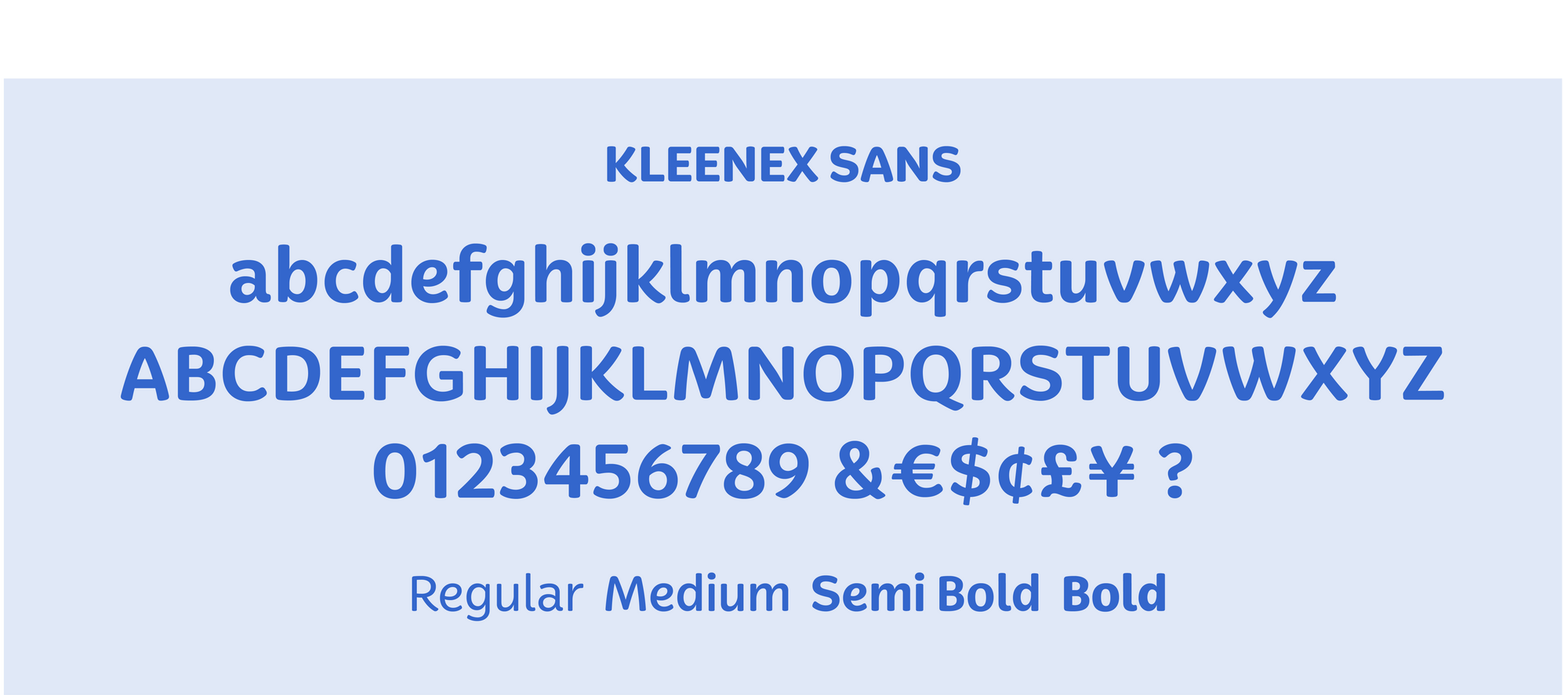
Kleenex Sans, Kimberly-Clark
Developed as part of the Kleenex brand’s refresh, Kleenex Sans is a four weight family that looks to the legendary Kleenex logo for its inspiration. Elements from the script are translated to extend the continuity of the brand while practical issues were considered for legibility and broad application to establish the typeface’s distinction.
Specs:
4 styles


