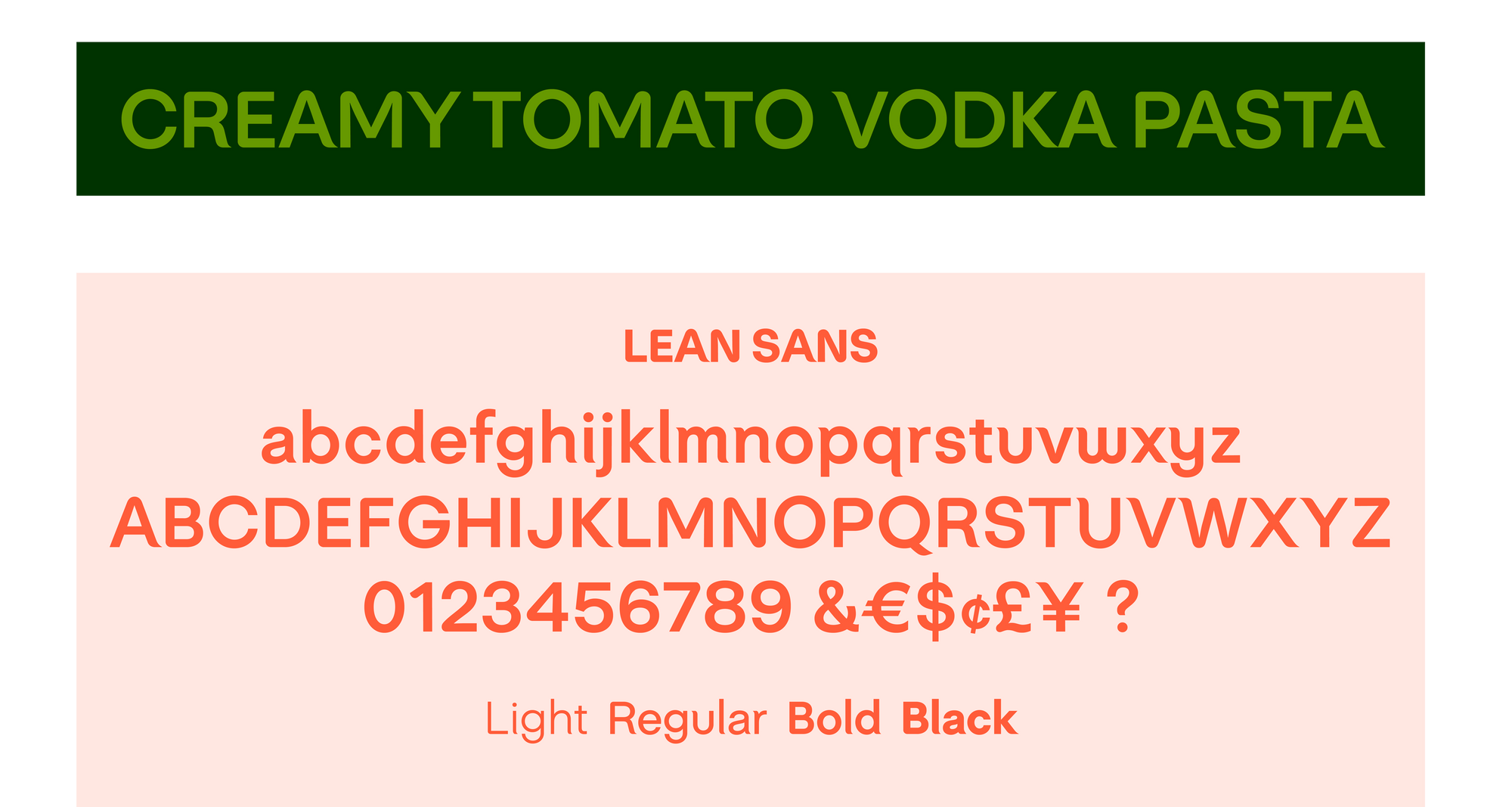
Lean Sans, Nestlé
The Lean Sans Family is an extension of the recent brand refresh of the health conscious consumer food brand, Lean Cuisine. Aspects of the current logo were translated and optimized into a typeface allowing for a wide range of usage from packaging to marketing materials. The type family extends the essence while allowing flexibility of application within the visual language.
Specs:
4 styles